LBT'S Brand Book
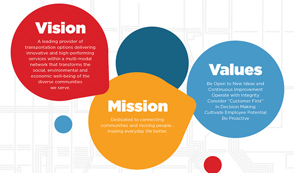
LBT Mission and Vision
communities and moving people…
making everyday life better.
A leading provider of transportation options delivering innovative and high-performing services within a multi-modal network that transforms the social, environmental and economic well-being of the diverse communities we serve.
Brand History
We’ve come a long way.
Like the cities and customers we serve, we have been evolving to adapt to new forms of communication and new choices in transportation. How we present ourselves to our customers must reflect the bright, dynamic and diverse communities we serve every day. This is the brief story of our brand identity changes that have occurred since late 2017. Below is a visual representation of LBT’s brand evolution, from where we were to where we are today. We’re sharing this with you to get your feedback and create a home where you can see all the ways LBT is communicating with out customers. We invite you to see the changes.
Examples of our old branding and design language circa 2012-2017
Logo Guide
A brand is not a logo.
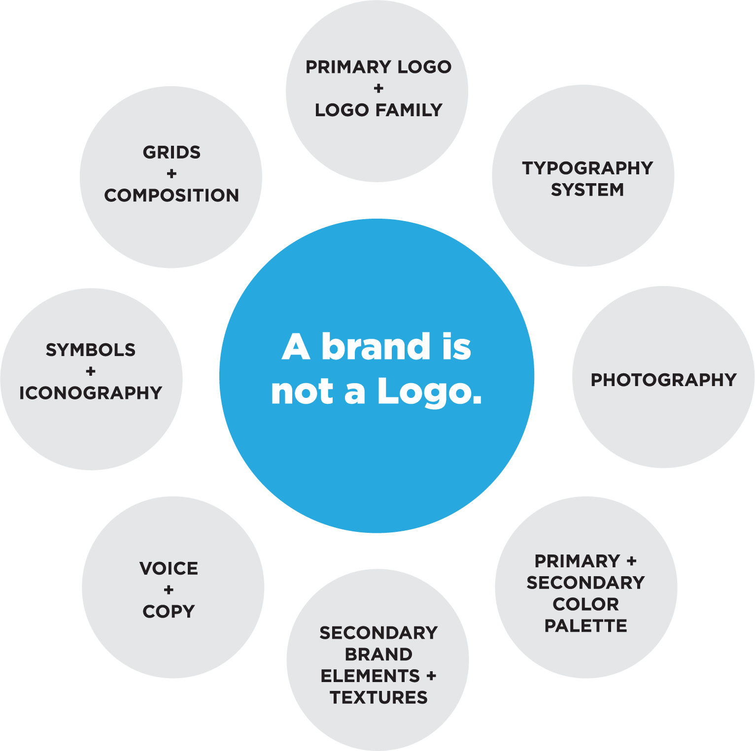
LBT’s brand is more than just our logo. The LBT brand is our buses and boats, and the people who interact with our customers every day. We communicate that brand through consistent colors and typefaces that represent who we are to the public. A Brand also has component parts which all work together to help tell our story. A logo will not do that job alone. This diagram represents all of the pieces that are part of the LBT Branding and Design system.
LBT Logo Family
Seasonal Logo Family

Fall

Winter
Spring and Summer
Pride
Patriotic
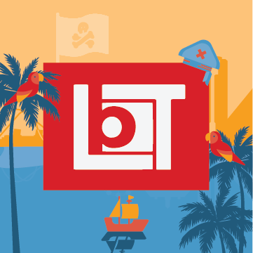
Pirate Invasion
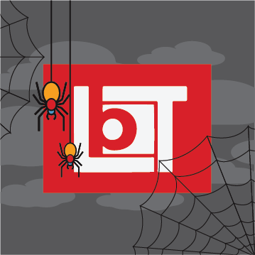
Halloween
Exclusion Zones
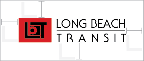
The minimum exclusion zone margin can be easily estimated by using the size of the “L” letterform in the LBT logo mark. On all sides, the exclusion zone should be measured from the farthest edge of the logo. No elements may encroach on this space.
DO NOT tilt or turn logo.
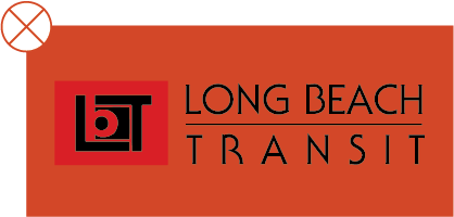
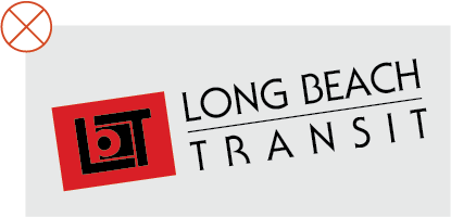
DO NOT place full color logo on a full color background.
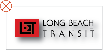
DO NOT add shadow behind the logo.
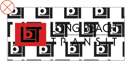
DO NOT place the logo on complex patterns or backgrounds.
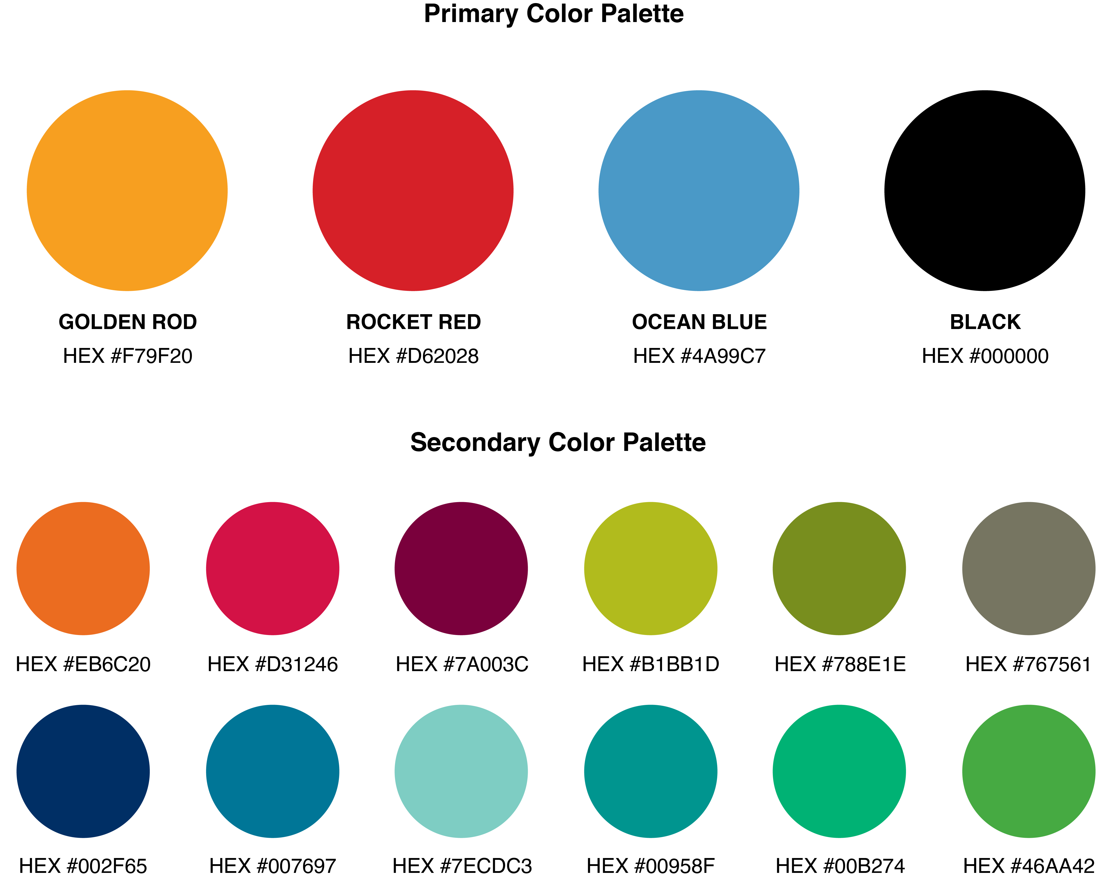
Color Palette
Colors that define us.
The Style Guide (adopted in 2011) lists LBT’s “primary” and “secondary” colors. The primary colors are prominently featured in our marketing and on our buses, boats and in other ways. The secondary colors were used in previous ads and other materials but have not been used widely in the past two years.
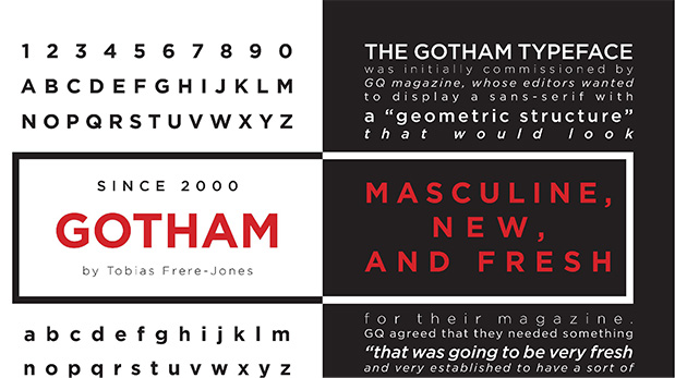
Typography
A universal, type family.
Long Beach Transit’s typeface is Gotham HTF for print, and our online typeface is Helvetica. They are very close cousins of each other and make a great technical pairing. These versatile font families are bold, legible, and full of personality.
LBT Sub-branding
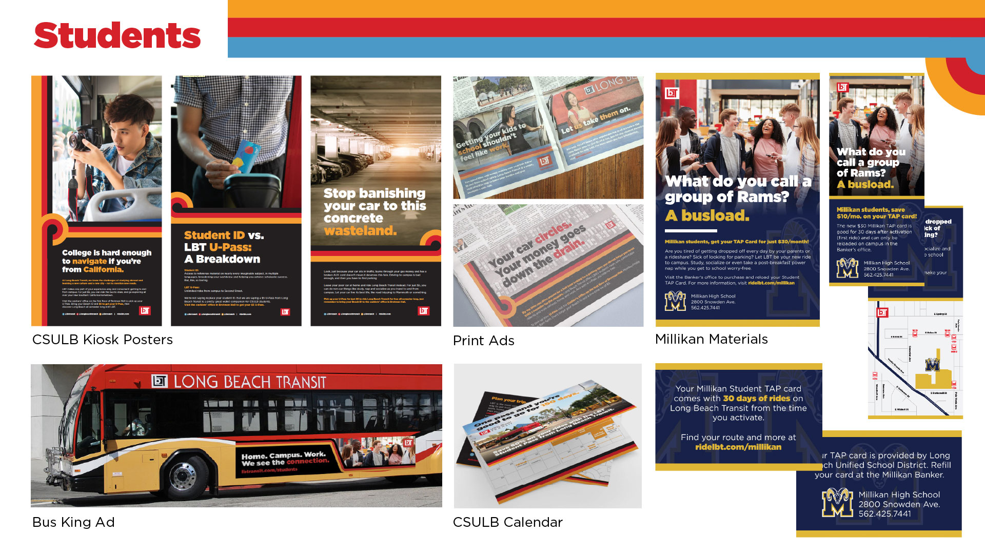
Students
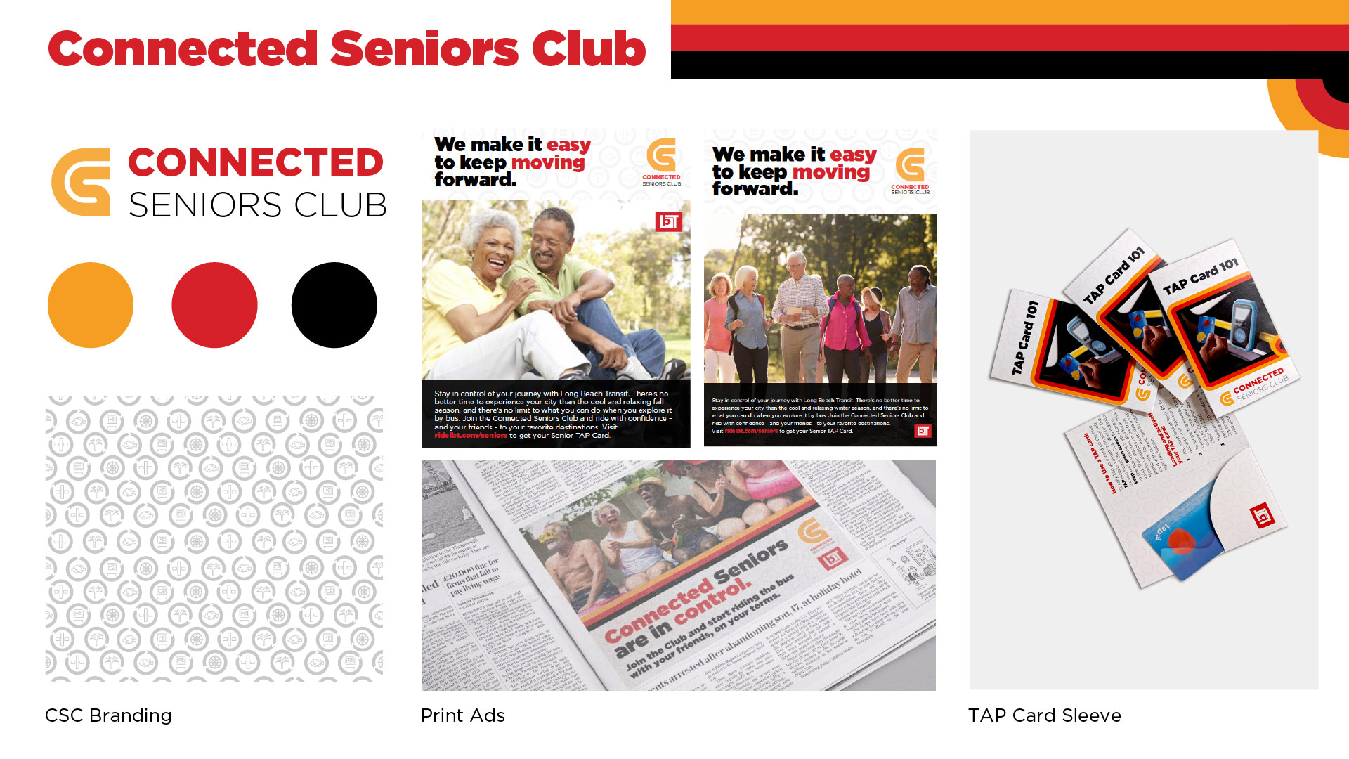
Connected Seniors
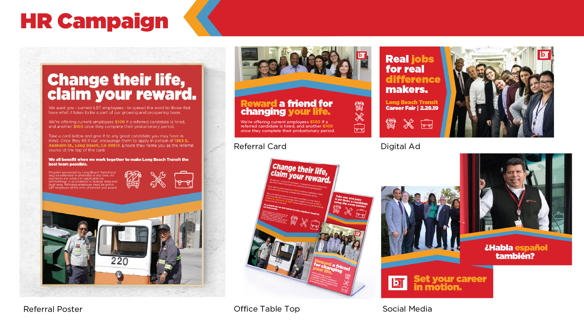
HR
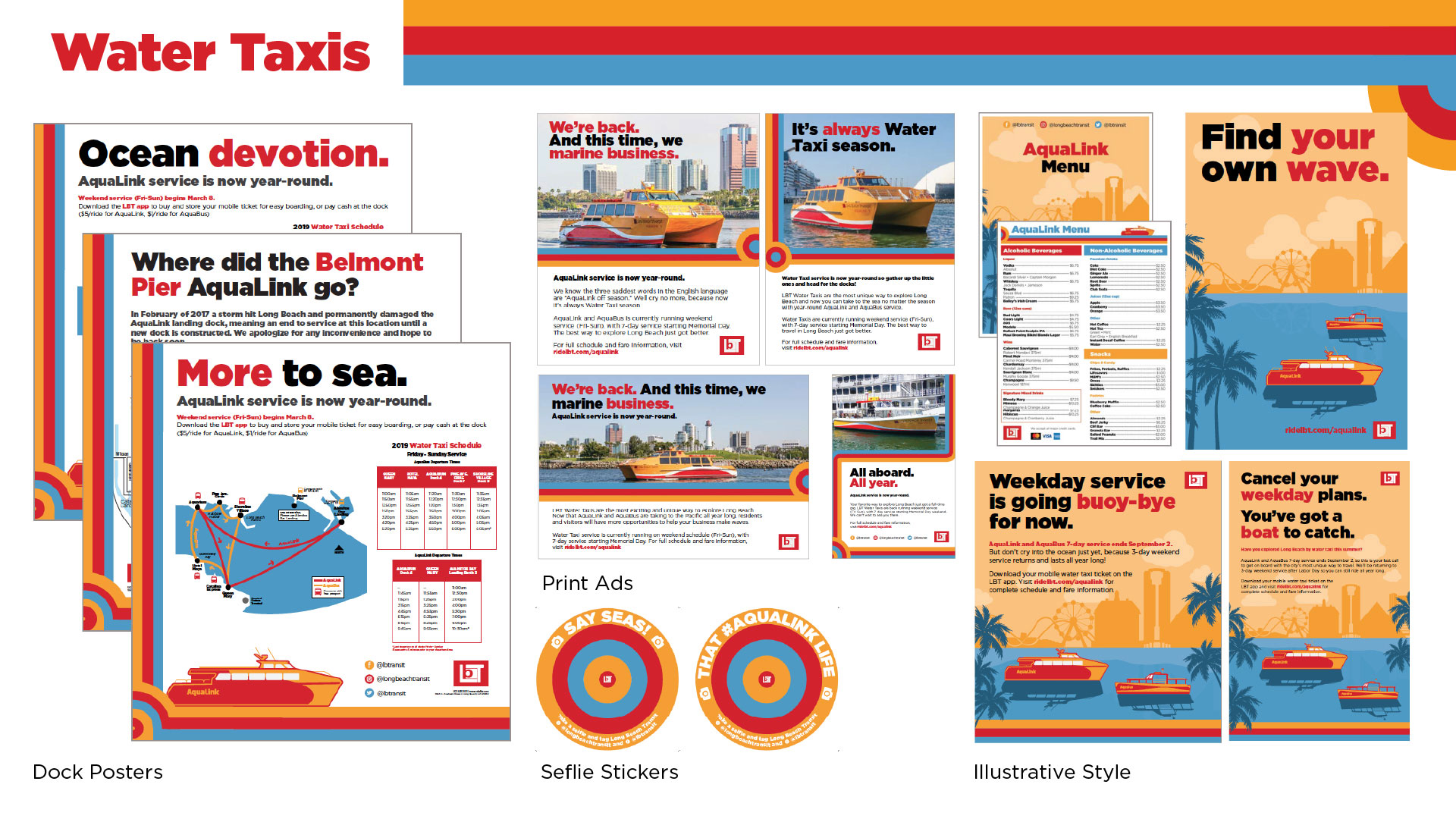
Water Taxis
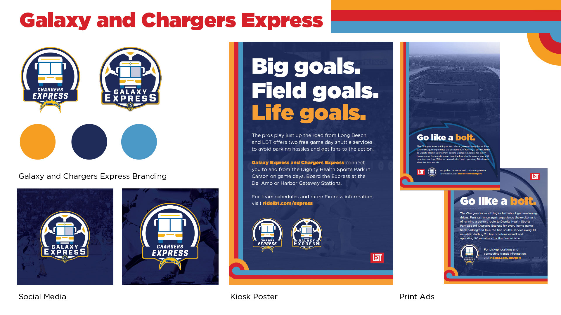
Galaxy and Charger Express
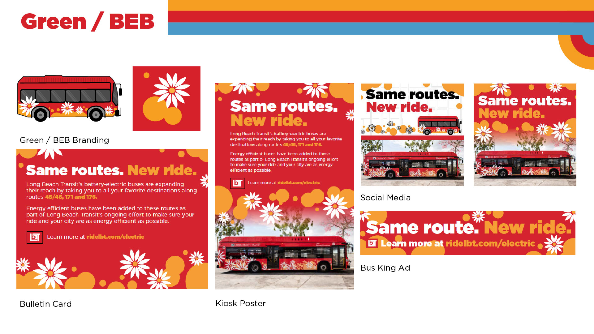
Green/BEB
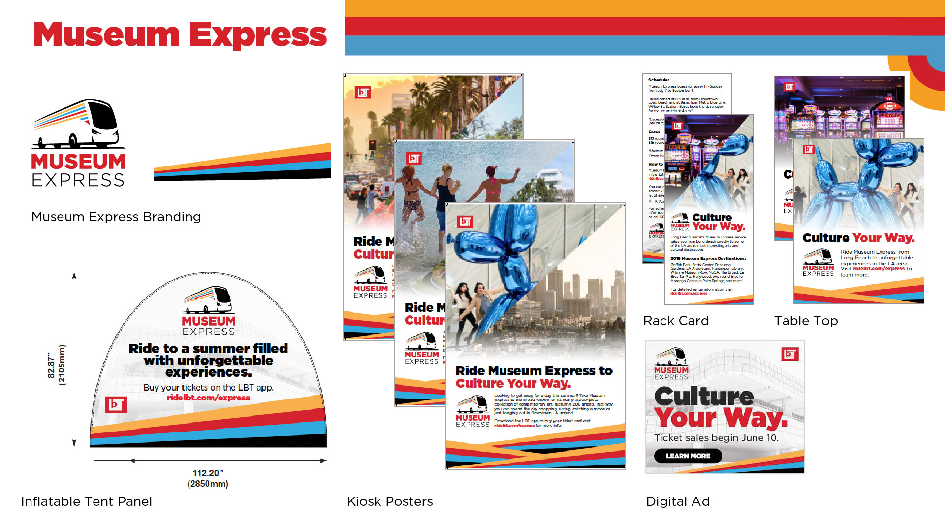
Museum Express
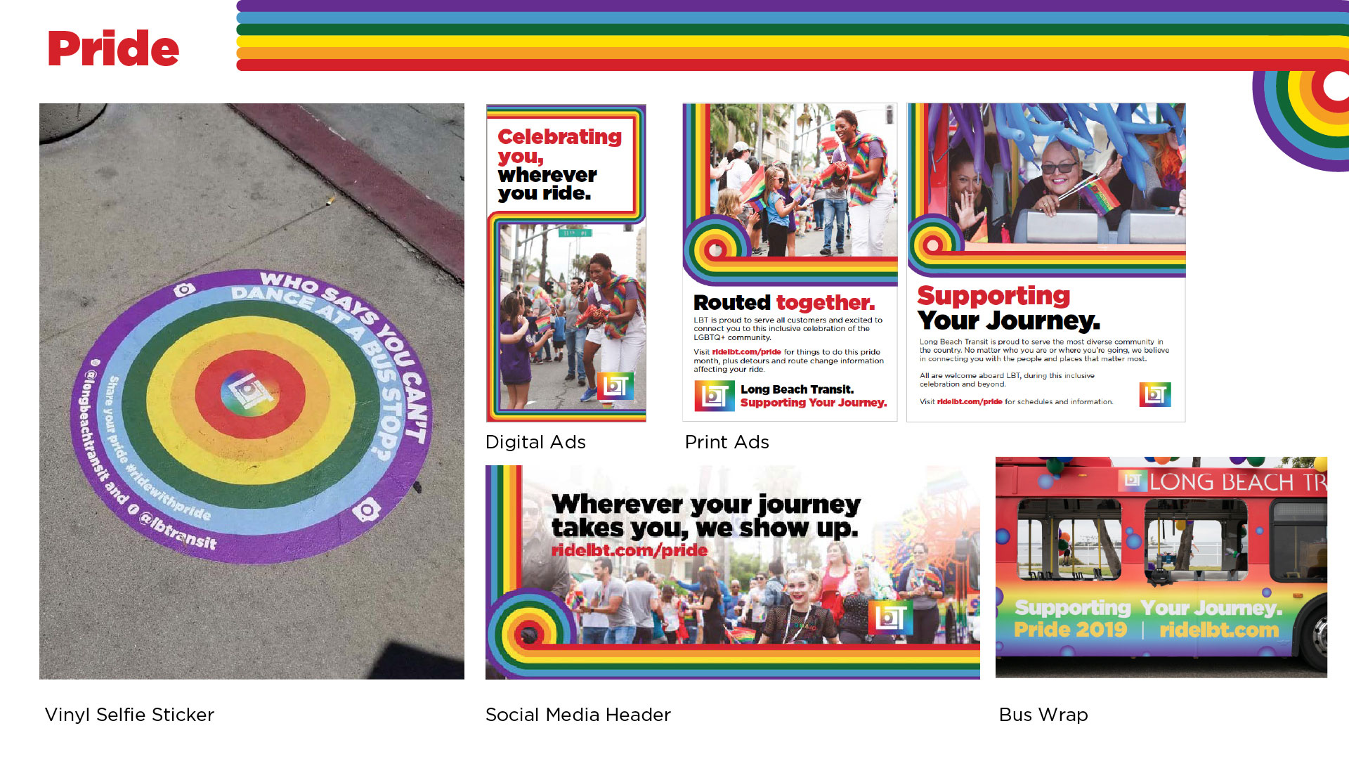
Pride
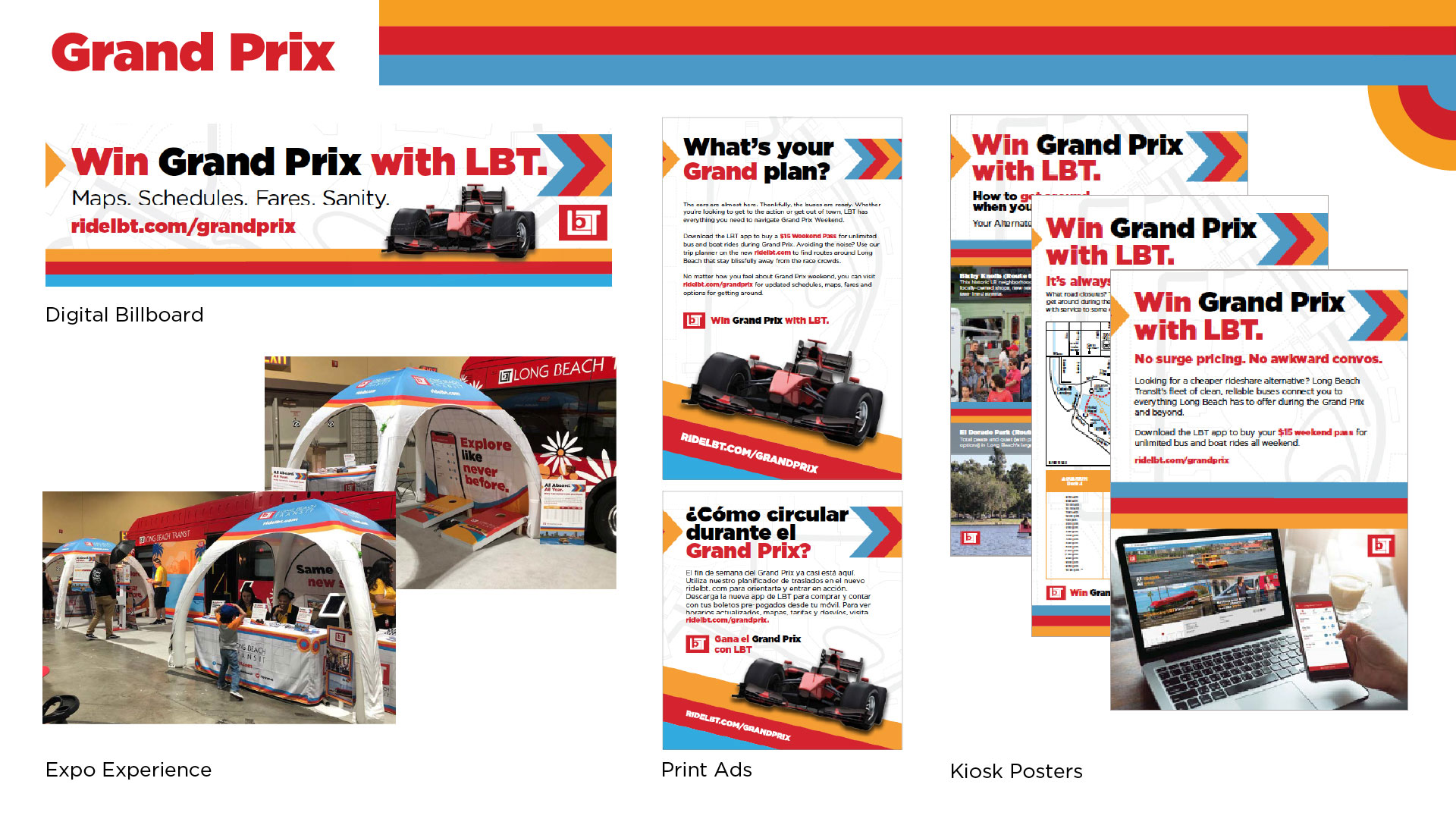
Grand Prix
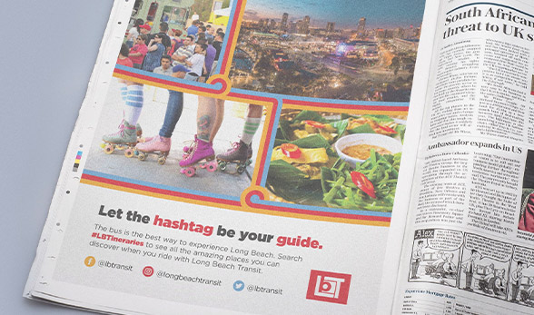
Photography
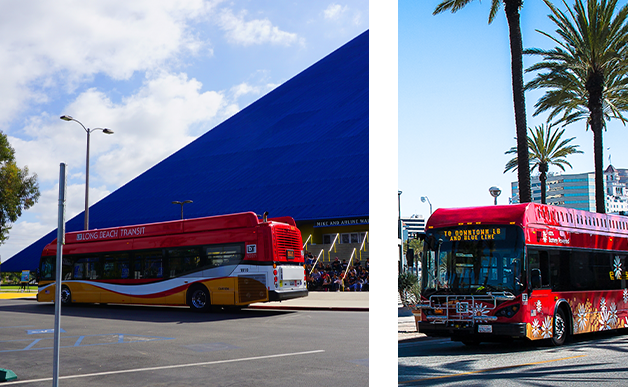
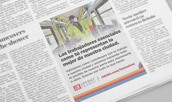
Photography of our Long Beach Transit buses should achieve a strong look with a single-focus composition. The bus should be in focus while background features are soft or out of focus.
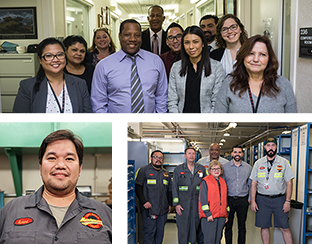
Staff:
Photos of staff should be authentic featuring the staff in their true work environments.
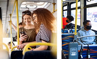
Customers:
Customers featured in photos should feature single-focus compositions. Customers should more often than not be depicted utilizing a Long Beach Transit service.
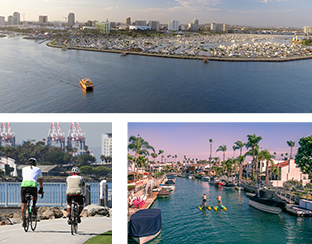
Long Beach:
Photography of Long Beach should be high quality and should feature authentic snapshots of the Long Beach community.
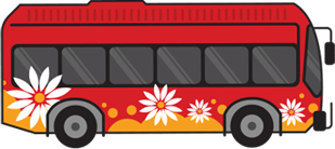
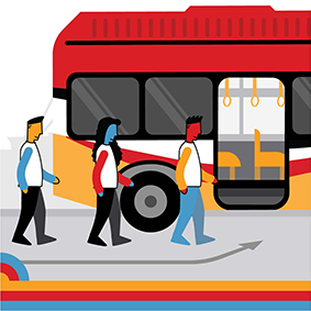
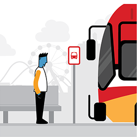
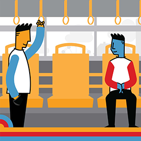
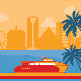
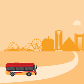
Vector Graphics and Illustration


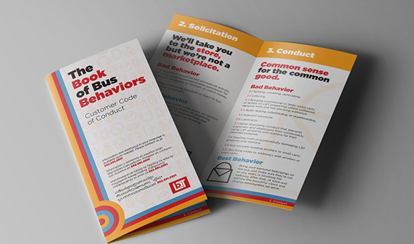
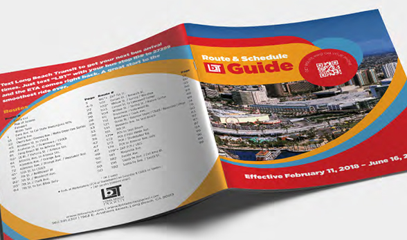
Documents and Templates
To request specific Marketing and Communications materials outside of what is below, please visit teamlbt.com/crc-team/
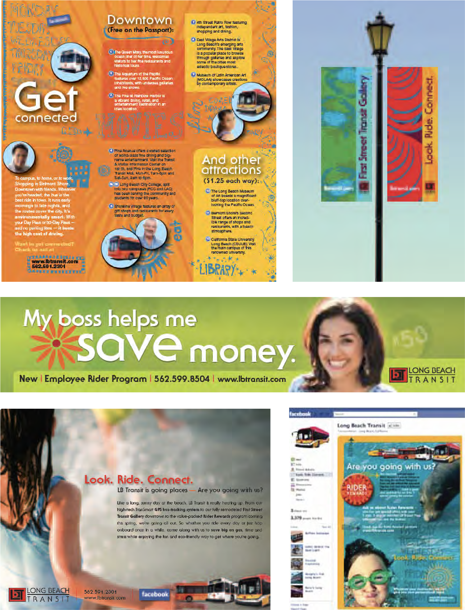
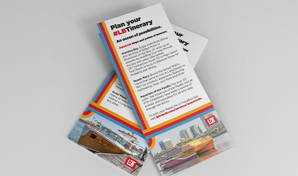
Live In Market Applications
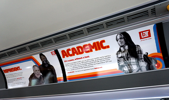
On Board
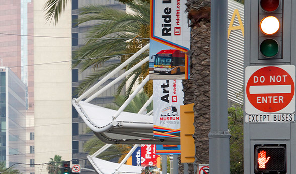
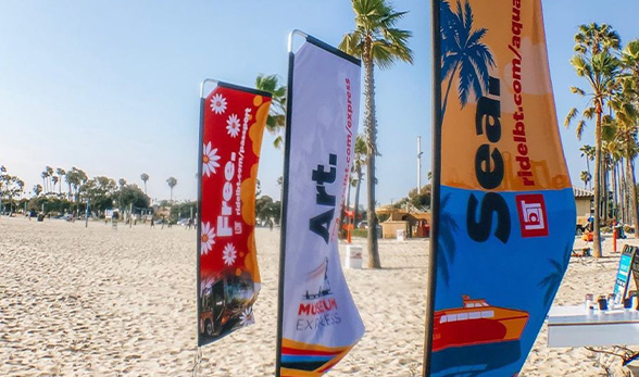
For a complete list of in market materials head to teamlbt.com/community/ or check out teamlbt.com/moving/ to see our current campaign materials.


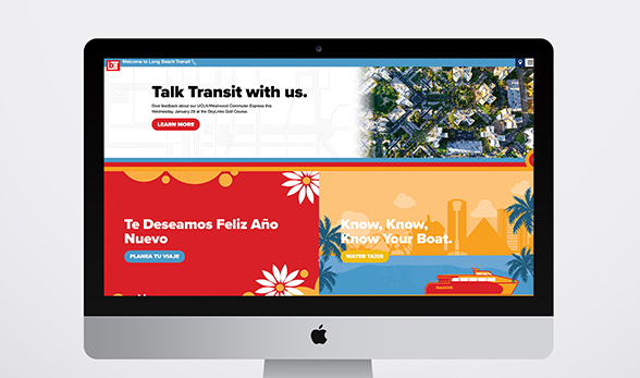
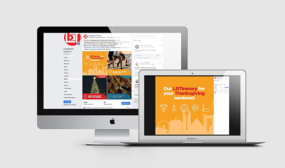
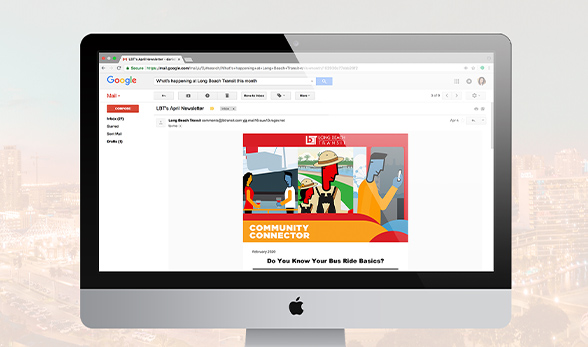
Digital
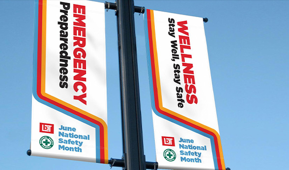
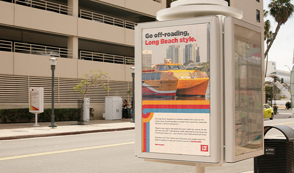
Out Of Home