The LBT Brand Story
We’ve come a very long way.
Like the cities and customers we serve, we have been evolving to adapt to new forms of communication and new choices in transportation. How we present ourselves to our customers must reflect the bright, dynamic and diverse communities we serve every day.
We’re sharing this with you to get your feedback and create a home where you can see all the ways LBT is communicating with our customers.
Need help with a PowerPoint presentation? Want to make sure you’re using the right logo or fonts? Click the SharePoint link below!
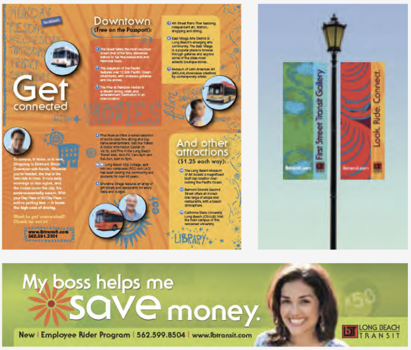
Examples of our old branding and design language circa 2012-2017
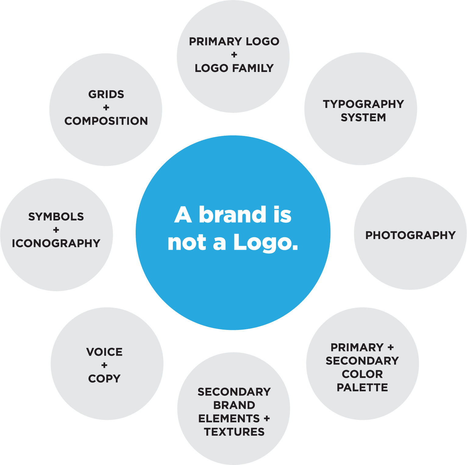
A brand is not a logo.
LBT’s brand is more than just our logo. The LBT brand is our buses and boats, and the people who interact with our customers every day. We communicate that brand through consistent colors and typefaces that represent who we are to the public. A Brand also has component parts which all work together to help tell our story. A logo will not do that job alone. This diagram represents all of the pieces that are part of the LBT Branding and Design system.
We’re sharing this with you to get your feedback and create a home where you can see all the ways LBT is communicating with our customers.
Current Campaigns Library
Check out some of our media campaign placements!
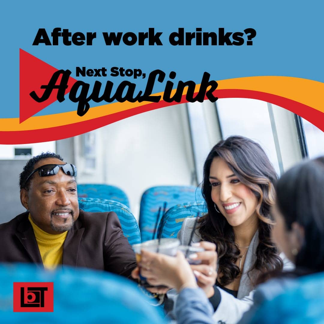
Water Taxi Campaign
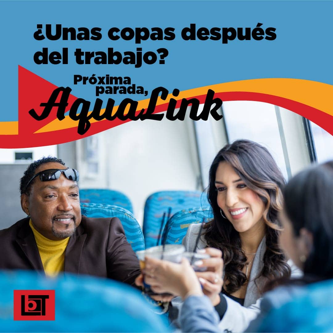
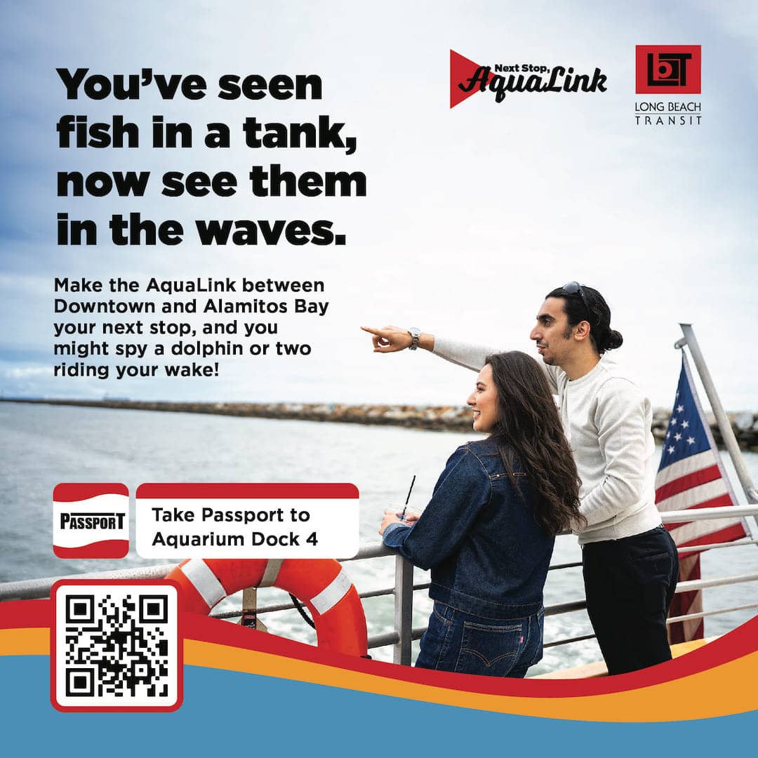
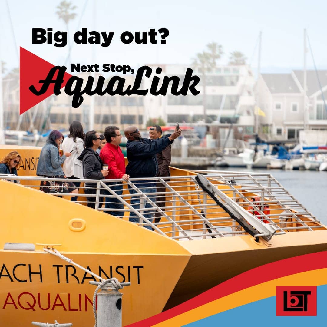
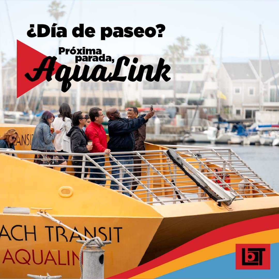
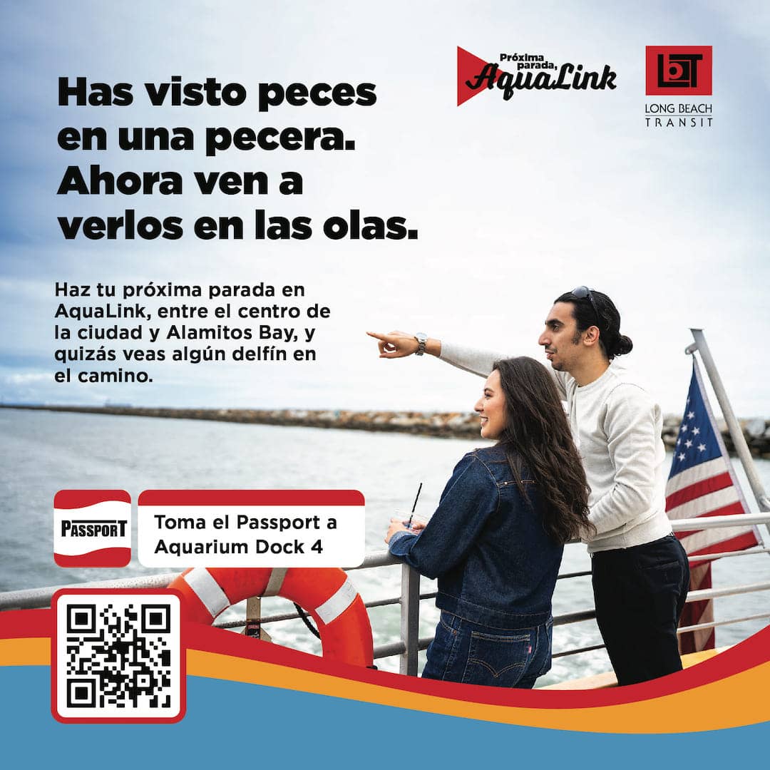
Next Stop, AquaLink
Next Stop, AquaLink – English Version
Next Stop, AquaLink – Spanish Version
Ridership Recruitment Campaign:
Ride The Bus
Ride The Bus – English Version
Ride The Bus – Spanish Version
Student Outreach Campaign:
Bussin’ is Easy
Bussin’ is Easy – English Version
Bussin’ is Easy – Spanish Version
LBT’s Brand Book
View the LBT Brand Book on ridelbt.com
